I've audited a lot of websites.
Enterprise platforms, healthcare portals, nonprofit landing pages, marketing sites for companies that absolutely should know better. And across all of them — regardless of industry, budget, or how talented the team is — the same handful of problems shows up every single time.
That's not a coincidence. It's a systemic gap. Accessibility doesn't usually fail because someone made a bad decision. It fails because nobody made any decision. It wasn't on the checklist. It wasn't in the design brief. It got skipped in QA. And now it's sitting in production, quietly turning people away.
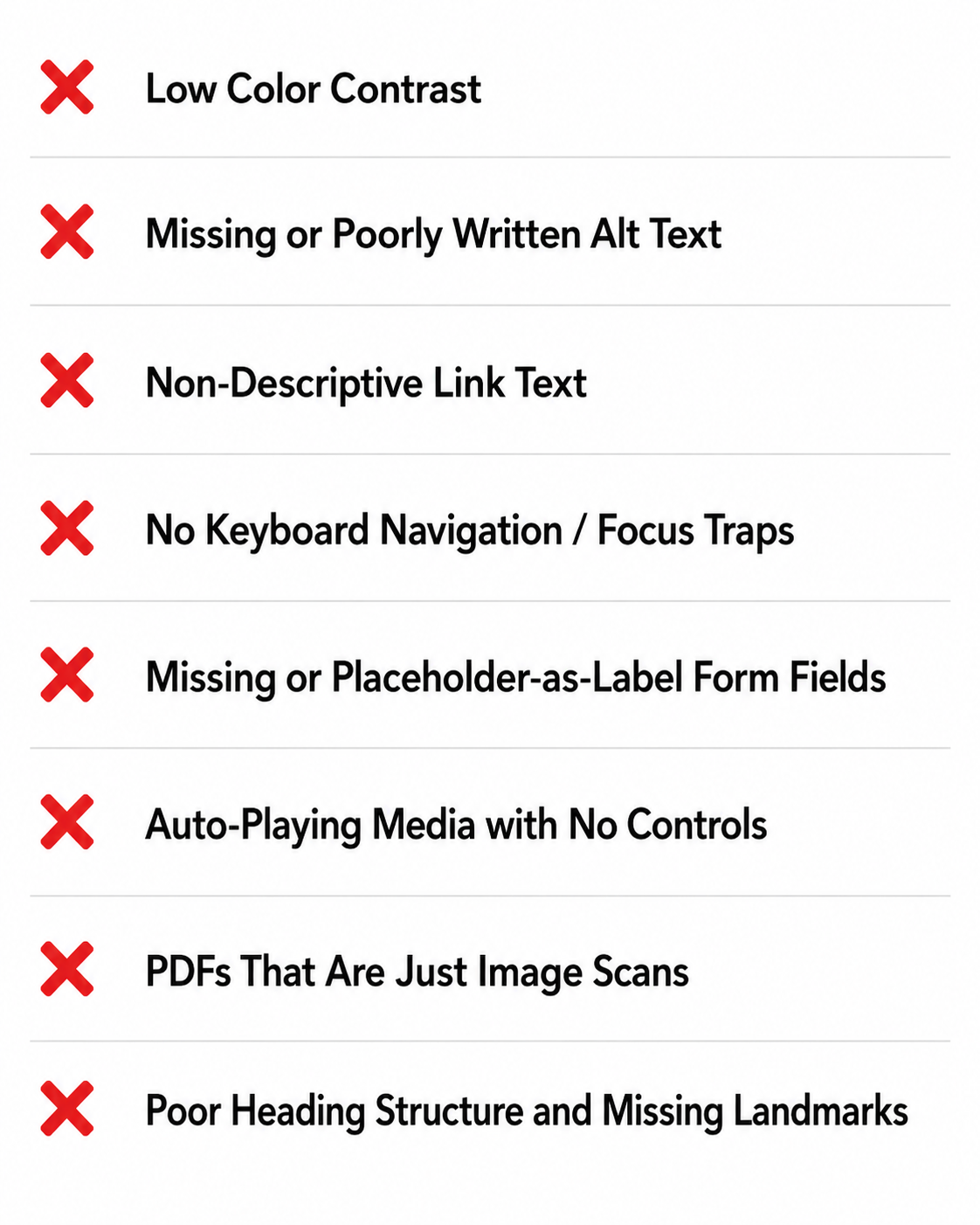
In honor of Global Accessibility Awareness Day, here are the eight issues I see most often, who they actually affect, and how to start thinking about fixing them — because spoiler: the fix isn't always a developer problem.
1. Low Color Contrast
What it is: The visual difference between text and its background isn't strong enough to read comfortably. WCAG requires a 4.5:1 contrast ratio for normal text, 3:1 for large text.
Who it affects: People with low vision, color blindness, or situational impairments — which includes anyone reading on a phone in direct sunlight. That "sleek" light gray subheading on a white background? It's failing a significant portion of your audience.
How to fix it: This one starts in design, not dev. Run your color palette through WebAIM's Contrast Checker or use the built-in accessibility panel in Figma or browser DevTools before anything ships. If your brand colors are the problem, that's a conversation to have with leadership — it's a brand governance issue as much as a technical one.
2. Missing or Poorly Written Alt Text
What it is: Images without a text alternative that describes their content or function. Screen readers either skip them entirely or — worse — read out the file name or src URL.
Who it affects: Blind users and low-vision users relying on screen readers. Also search engines, but that's a separate conversation.
How to fix it: This is a content problem as much as a code problem. Developers can add the alt attribute, but the quality of what goes in it is a content strategy decision. A photo of your team at an event needs a real description. An infographic with data in it needs that data communicated in text somewhere. And purely decorative images? Those get alt="" — empty, not missing. There's a meaningful difference between the two.
3. Non-Descriptive Link Text
What it is: Links that say "click here," "read more," or "learn more" with no surrounding context that explains where they go.
Who it affects: Screen reader users often navigate by pulling up a list of all links on a page — a feature built into virtually every screen reader. If that list is fifteen instances of "click here," it's useless. Keyboard-only users and people with cognitive disabilities are also affected; clear link text reduces cognitive load for everyone.
How to fix it: This is a content and copywriting fix. "Download the 2024 Annual Report" is a link. "Click here" is a shrug. Go through your CMS and update link text at the source. If your platform auto-generates "read more" links, work with dev to append visually-hidden context or an aria-label — but the real fix is writing better links from the start.
4. No Keyboard Navigation / Focus Traps
What it is: Interactive elements — menus, modals, dropdowns, carousels — that can't be accessed or exited using only a keyboard. Sometimes focus gets "trapped" inside a component with no way out.
Who it affects: People who can't use a mouse due to motor disabilities, power keyboard users, and anyone using switch access or other adaptive input devices.
How to fix it: Tab through your entire site right now. If you can't reach something, or you open a modal and can't close it without a mouse, you have a problem. For custom components, this is a developer fix — proper tabindex management, focus trapping patterns for modals (intentional, not accidental), and ensuring Escape closes things it should close. For off-the-shelf components and plugins, check for accessibility documentation before you buy or install.
5. Missing or Placeholder-as-Label Form Fields
What it is: Input fields with no <label> element — or fields that use placeholder text as a substitute for a label.
Who it affects: Screen reader users who need a label announced when they land on a field. Also anyone who's ever clicked into a form field, started typing, and immediately forgotten what it was asking for — because the placeholder text disappeared. That's a usability issue for everyone, not just people with disabilities.
How to fix it: Every input needs a real, programmatically associated label. Placeholder text is a hint, not a label — treat it that way. If the design calls for a "floating label" pattern, make sure it's implemented correctly and not just CSS smoke and mirrors over a missing <label>. This is a design and dev collaboration fix; get alignment on the pattern before it gets built.
6. Auto-Playing Media with No Controls
What it is: Video or audio that starts playing automatically when a page loads, with no obvious way to pause, stop, or mute it.
Who it affects: People with vestibular disorders who are sensitive to motion and sudden movement. People with cognitive disabilities who find unexpected audio disorienting. Screen reader users whose software gets drowned out by your background video. And honestly — everyone who's opened a tab at work and frantically looked for the source of the noise.
How to fix it: Don't autoplay. If you absolutely must autoplay for design reasons, start it muted, keep it short, and make pause/stop controls immediately visible and keyboard accessible. This is a combination of a UX decision and a dev implementation — both parties need to be aligned on the requirement.
7. PDFs That Are Just Image Scans
What it is: PDF documents that are photos of paper — or exported in a way that renders text as a flat image — with no actual selectable, readable text layer underneath.
Who it affects: Screen reader users get a completely empty document. People who rely on text-to-speech tools hit a wall. Users who need to zoom in and reflow text can't do it. This is especially prevalent in healthcare, legal, government, and nonprofit sectors where a lot of documentation comes from legacy paper processes.
How to fix it: Run your PDFs through Adobe Acrobat's accessibility checker — it'll tell you fast whether a real text layer exists. For new documents, export from the source (Word, InDesign, Google Docs) with accessibility settings enabled rather than printing to PDF. For legacy documents, OCR processing can help, though it's not perfect. This is often an operations and content management problem more than a dev problem.
8. Poor Heading Structure and Missing Landmarks
What it is: Pages with no logical heading hierarchy — or headings chosen for visual size rather than document structure. Also pages with no ARIA landmarks (<main>, <nav>, <header>, <footer>) to help users orient themselves.
Who it affects: Screen reader users navigate pages primarily by headings and landmarks, jumping between sections the way a sighted user visually scans a page. If your heading order jumps from an H1 to an H4 because someone wanted smaller text, or if your entire page is wrapped in <div> soup with no structural meaning, that navigation breaks completely.
How to fix it: Headings are a content architecture decision first. What's the hierarchy of information on this page? That determines heading levels — and then CSS handles the visual size separately. Landmarks are a dev implementation, but a simple one. Use semantic HTML elements correctly and you get most of them for free. This is one of those fixes that's genuinely fast once the team understands the rule.
The Real Problem Isn't Complexity
None of these are exotic. None of them require a months-long remediation project or a complete rebuild. What they require is catching them earlier in the process — in the design file, in the content brief, in the component library, in the QA checklist.
Accessibility debt accumulates the same way technical debt does: not through malice, but through omission. The fix isn't one heroic effort — it's adding the right questions to the process upstream, where the decisions are actually being made.
That means designers asking "what's the contrast ratio on this?" before it gets to dev. It means content teams writing real link text from the start. It means developers pushing back on component libraries that aren't keyboard accessible. It means someone, somewhere, owning accessibility as a shared team responsibility — not a checkbox on someone else's ticket.
That's what GAAD is really for. Not guilt. Awareness — and then what you actually do with it.